Designing an effective Power BI dashboard is crucial for transforming raw data into meaningful insights that drive informed decision-making. Power BI, a business analytics tool by Microsoft, offers robust data visualization capabilities. This article will explore the essential elements of designing Power BI dashboards, including planning, key features, design principles, and advanced techniques to ensure your dashboards are both functional and visually appealing.
What is Dashboard in Power BI?
Power BI dashboards are single-pages, interactive, and visually-rich representations of data ,often called a canva, designed to provide an at-a-glance view of key metrics and performance indicators. They consolidate data from various sources, allowing users to monitor business metrics, track trends, and make data-driven decisions.
Key Features of Dashboards in Power BI
- Visualizations: A dashboard can include a variety of visualizations such as charts, graphs, maps, and gauges. These visuals can be pinned from different reports, providing a comprehensive overview.
- Tiles: Each visualization on a dashboard is called a tile. You can resize, move, and arrange these tiles to create a customized layout.
- Interactivity: Dashboards are interactive, meaning you can click on tiles to open the underlying report for more detailed analysis. You can also set up interactive elements like buttons and links.
- Real-time Data: Power BI dashboards can display real-time data, which is particularly useful for monitoring key metrics and KPIs.
- Data Sources: A dashboard can aggregate data from multiple sources, giving you a consolidated view of your data.
- Sharing and Collaboration: Dashboards can be shared with others in your organization, allowing for collaborative analysis and decision-making. Users can also set alerts to receive notifications when data changes.
- Mobile Accessibility: Power BI dashboards are accessible on mobile devices through the Power BI mobile app, ensuring you have access to your data anytime, anywhere.
- Customization: You can customize the appearance and behavior of your dashboard, including themes, layout, and interactivity options, to better meet your needs and preferences.
- Integration: Power BI integrates with a wide range of data sources and other Microsoft services like Azure, Excel, and SharePoint.
Difference between Power BI Dashboard and Reports
A dashboard and a report in Power BI serve different purposes and have distinct characteristics. Here are the main differences between the two:
| Aspect | Dashboard | Report |
|---|
| Purpose | High-level overview, key metrics monitoring | Detailed analysis and data exploration |
| Structure | Single page (canvas) | Multiple pages |
| Content | Tiles pinned from one or more reports | Interactive visualizations based on a single dataset |
| Interactivity | Limited interaction (e.g., click to open reports) | Rich interactivity (slicers, drill-through, custom visuals) |
| Data Source | Aggregated data from multiple reports | Based on a single dataset or set of related datasets |
| Data Updates | Can display real-time data | Updated on a scheduled basis |
| Usage | Quick insights, monitoring key performance indicators | In-depth analysis, detailed data exploration |
| Sharing | Share with others for high-level view | Share for collaborative analysis |
| Alerts | Users can set up alerts | No alert functionality |
| Creation | Created by pinning visuals from reports or custom tiles | Authored using Power BI Desktop or service with complex data modeling |
| Customization | Layout and appearance customization | Data modeling, designing visuals, creating interactions |
| Comments and Annotations | Not typically used for comments | Users can add comments and annotations |
Planning Your Power BI Dashboard
Let’s understand how to create dashboard in Power BI. Effective dashboard design begins with thorough planning. Consider the following steps:
Define Objectives
- Identify the primary purpose of the dashboard. Is it to track sales performance, monitor financial metrics, or analyze customer behavior?
- Determine the key performance indicators (KPIs) that align with your business goals.
Understand Your Audience
- Identify who will be using the dashboard. Different stakeholders may require different levels of detail and types of visualizations.
- Tailor the dashboard to meet the specific needs and expertise levels of your audience.
Data Preparation
- Ensure data accuracy and completeness.
- Clean and transform data to make it suitable for analysis.
- Establish a data refresh schedule to keep the dashboard updated.
Design Principles for Power BI Dashboards
Adhering to design principles ensures that your dashboard is not only aesthetically pleasing but also functional and user-friendly.
Simplicity and Clarity
- Avoid Clutter: Use a clean and simple design. Avoid overloading the dashboard with too many visuals or excessive information.
- Consistent Layout: Maintain a consistent layout and design language throughout the dashboard.
- Readable Fonts: Use legible fonts and appropriate font sizes.
Effective Use of Colors
- Color Coding: Use colors to differentiate data points, but avoid using too many colors. Stick to a consistent color scheme.
- Highlighting: Use colors to highlight important metrics and trends.
Visual Hierarchy
- Priority Placement: Place the most important visuals and KPIs at the top or center of the dashboard.
- Logical Flow: Arrange visuals in a logical order to guide the user through the data story.
Interactive Elements
- Filters and Slicers: Include interactive filters and slicers to allow users to customize their view of the data.
- Drill-Down Capabilities: Enable drill-down features to provide detailed insights into specific data points.
How to Make Dashboard in Power BI?
Following are the steps to create dashboard in power bi:
Step 1: Connect to Data Sources
- Use Power BI Desktop to connect to various data sources like databases, Excel files, and cloud services.
- Ensure data sources are reliable and provide the necessary data for analysis.
Step 2: Data Modeling
- Create relationships between different data tables.
- Use DAX (Data Analysis Expressions) to create calculated columns and measures.
Step 3: Create Visualizations
- Choose appropriate visualizations for your data (e.g., bar charts, line charts, pie charts, maps).
- Customize the appearance of each visualization to enhance clarity and impact.
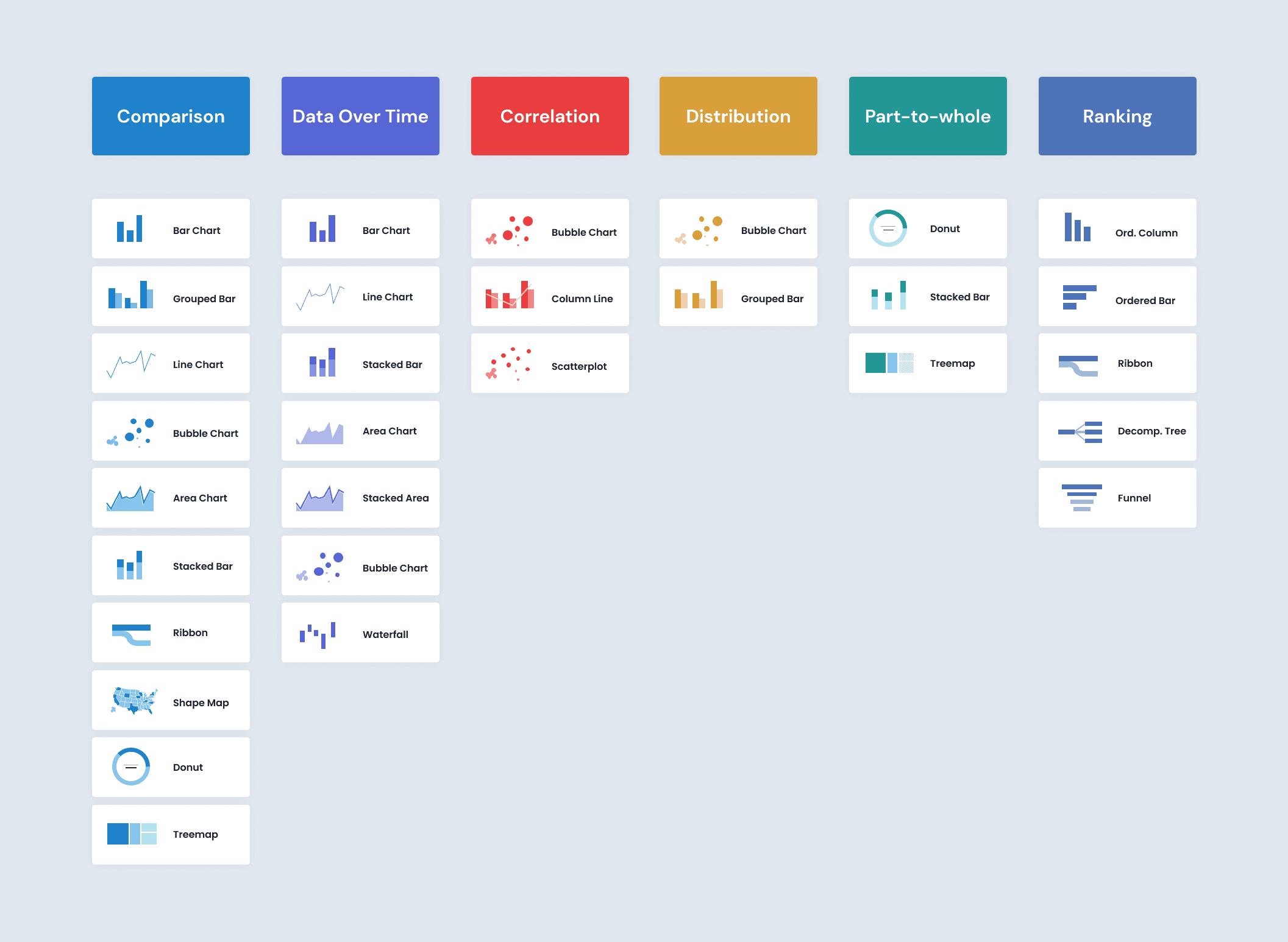
Choosing Appropriate Visualizations
Step 4: Arrange the Dashboard
- Arrange visualizations logically and ensure they fit well within the dashboard space.
- Group related visuals together to make it easier for users to interpret the data.
Step 5: Add Interactivity
- Add slicers and filters to enable users to interact with the data.
- Configure drill-down options to allow users to explore data at different levels of detail.
Step 6: Publish and Share
- Publish the dashboard to the Power BI service.
- Share the dashboard with relevant stakeholders and set permissions as needed.
Advanced Techniques for Power BI Dashboards
Custom Visuals
- Use custom visuals available in the Power BI marketplace to enhance your dashboard.
- Create your own custom visuals using R or Python scripts for specialized requirements.
Embedding Dashboards
- Embed Power BI dashboards into other applications like SharePoint, Teams, or custom web applications.
- Use Power BI API for seamless integration and embedding.
Real-Time Dashboards
- Set up real-time data streaming to display live data.
- Use Power BI’s real-time data capabilities to monitor critical metrics and respond to changes promptly.
Performance Optimization
- Optimize the performance of your dashboard by reducing the complexity of data models and visualizations.
- Use Power BI’s performance analyzer to identify and resolve performance bottlenecks.
Power BI Dashboards Examples
Here are some examples of Power BI dashboards with stunning power bi dashboard designs, each tailored to different business needs and purposes:
1. Executive Dashboard
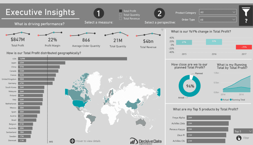
An Executive Dashboard
Purpose: Provide top-level management with a quick overview of key business metrics and KPIs.
Features:
- Key Metrics: Displays total profit, profit margin, average order quantity, total quantity, and total revenue.
- Geographical Distribution: Visualizes profit distribution across different regions.
- Year-over-Year Change: Highlights annual changes in total profit.
- Planned vs. Actual Profit: Compares planned profit to actual results.
- Running Total: Shows cumulative total profit over time.
- Top Products: Lists top-performing products by profit.
- Interactive Filters: Allows data refinement by selecting measures, product categories, and order types.
2. HR Analytics Dashboard
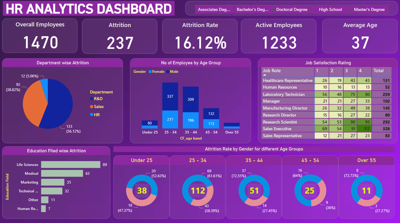
HR Analytics Dashboard
Purpose: Provide HR management with a comprehensive overview of employee metrics and attrition analysis.
Features:
- Key Metrics: Displays overall employees, attrition numbers, attrition rate, active employees, and average age.
- Department-wise Attrition: Shows attrition distribution across different departments.
- Employee Demographics: Visualizes the number of employees by age group and gender.
- Job Satisfaction: Presents job satisfaction ratings by job role.
- Education-wise Attrition: Highlights attrition rates across different education fields.
- Attrition by Age and Gender: Displays attrition rates by gender for different age groups.
- Interactive Filters: Allows selection of employees by degree type to refine the data.
3. E-Commerce Sales Dashboard
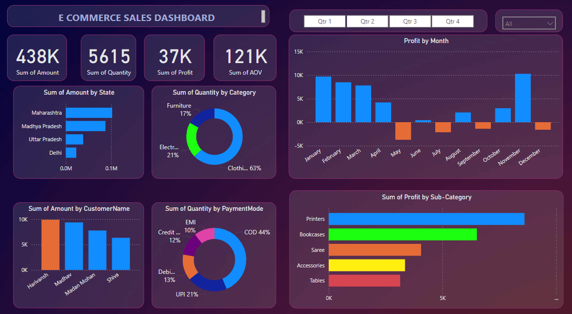
Sales Dashboard in Power BI
Purpose: Provide insights into e-commerce sales performance and key metrics.
Features:
- Key Metrics: Displays sum of amount, quantity, profit, and average order value (AOV).
- Sales by State: Shows the sum of sales amount by different states.
- Quantity by Category: Visualizes the distribution of sales quantities across product categories.
- Profit by Month: Displays monthly profit trends throughout the year.
- Sales by Customer: Highlights top customers based on the amount of sales.
- Quantity by Payment Mode: Shows the distribution of quantities sold by different payment modes.
- Profit by Sub-Category: Visualizes profit generated by different product sub-categories.
4. Customer Segmentation Dashboard
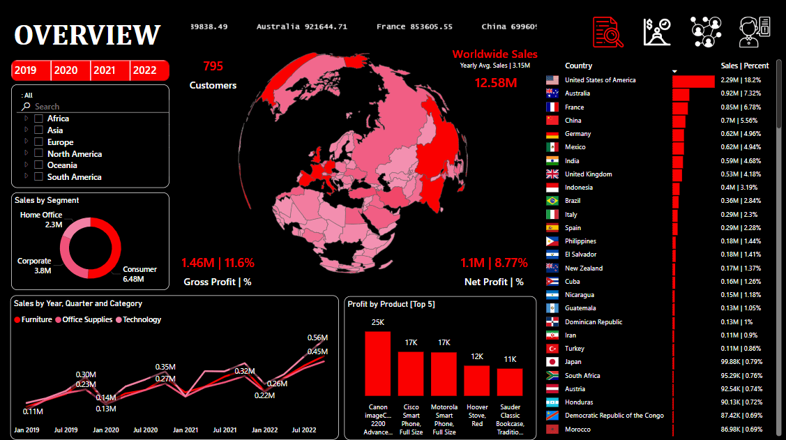
Customer Segmentation Dashboard
Purpose: Provide a comprehensive overview of worldwide sales and key performance metrics.
Features:
- Key Metrics: Displays total customers, worldwide sales, gross profit, and net profit.
- Geographical Distribution: Visualizes sales distribution across different countries with a world map.
- Sales by Segment: Shows sales distribution by segments such as Home Office, Corporate, and Consumer.
- Yearly Sales Trends: Displays sales trends over the years, categorized by quarter and product category.
- Top Countries by Sales: Lists top countries based on sales volume.
- Top Products by Profit: Highlights the top 5 products contributing to profit.
- Interactive Filters: Allows selection by year and region to refine data.
Conclusion
Designing an effective Power BI dashboard involves careful planning, adhering to design principles, and leveraging advanced features to create interactive and insightful data visualizations. By following these guidelines, you can create dashboards that not only provide valuable insights but also enhance decision-making processes within your organization. Power BI’s flexibility and robust features make it an invaluable tool for business intelligence, enabling users to transform raw data into actionable insights effortlessly.
Key Takeaways on Designing Power BI Dashboards
- Power BI dashboards are interactive, single-page visuals designed to provide an at-a-glance overview of key metrics and performance indicators.
- Visualizations on dashboards include charts, graphs, maps, and gauges, which can be pinned from different reports for a comprehensive overview.
- Each visualization on a dashboard is called a tile, which can be resized, moved, and arranged to create a customized layout.
- Dashboards enable interactivity, allowing users to click on tiles to access detailed reports and set up interactive elements like buttons and links.
- They can display real-time data, making them useful for monitoring key metrics and KPIs as data changes occur.
- Power BI dashboards can aggregate data from multiple sources, providing a consolidated view that aids in better decision-making.
- Sharing and collaboration features allow dashboards to be shared within an organization, with alerts set up for data changes and mobile accessibility through the Power BI app.
- Customization options include themes, layout, and interactivity, enabling users to tailor dashboards to specific needs and preferences.
- Dashboards differ from reports in that they provide a high-level overview with limited interaction, whereas reports offer detailed analysis, rich interactivity, and are multi-page.
- Effective dashboard design involves defining objectives, understanding the audience, ensuring data accuracy, and following design principles such as simplicity, clarity, effective use of colors, visual hierarchy, and interactivity options.


