Effective data visualization in Power BI can transform complex data sets into intuitive insights, facilitating better decision-making processes. Power BI data visualization capabilities are vast, offering a range of charts in Power BI that cater to different analytical needs. In this guide, we will explore various types of visualization in Power BI and how to effectively use them to represent data.
Key Features of Power BI Visualizations
- Rich Set of Visuals: Power BI offers a rich set of built-in visuals, including bar charts, line charts, pie charts, maps, and more. Additionally, users can access custom visuals from the Power BI marketplace to meet specific needs.
- Interactive Dashboards: Power BI dashboards are interactive, allowing users to drill down into data, filter information, and view details on demand. This interactivity enables a deeper understanding of data trends and patterns.
- Data Connectivity: Power BI connects to a multitude of data sources, including Excel, SQL Server, Azure, and online services like Google Analytics. This versatility ensures that users can visualize data from virtually any source.
- Real-Time Data: Power BI supports real-time data streaming, enabling users to visualize and monitor live data. This feature is particularly useful for tracking key performance indicators (KPIs) and operational metrics.
- AI-Powered Insights: Power BI leverages artificial intelligence (AI) to provide insights such as automated data exploration, anomaly detection, and natural language queries, enhancing the analytical capabilities of users.
Types of Charts in Power BI
Power BI offers a variety of chart types, each serving specific purposes depending on the data being visualized. Here, we will delve into some of the most commonly used Power BI charts:
1. Bar and Column Charts
Bar and column charts are fundamental types of charts in Power BI that display data in horizontal or vertical bars. These charts are ideal for comparing quantities across different categories.
- Bar Charts: Best for comparing values across categories when you have long category names.
- Column Charts: Useful for showing data changes over a period or for comparing items.
Usage Example: Comparing sales figures across different regions.
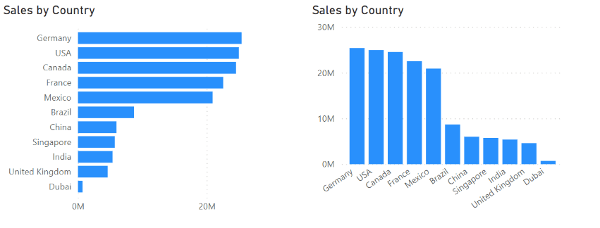
Bar and Column Charts
2. Line Charts
Line charts connect individual data points with lines, making them perfect for showing trends over time.
- Single Line Chart: For displaying trends of one variable over time.
- Multiple Line Chart: For comparing trends between multiple variables.
Usage Example: Monitoring monthly sales trends over regions
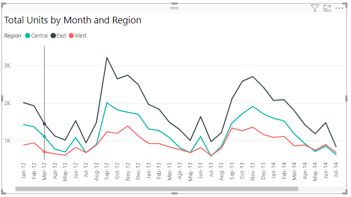
Line Chart
3. Pie and Donut Charts
Pie and donut charts represent data in segments, showing proportions of a whole.
- Pie Charts: Simple and effective for showing parts of a whole.
- Donut Charts: Similar to pie charts but with a blank center, often used for aesthetic preference.
Usage Example: Visualizing share distributions among Buyers.
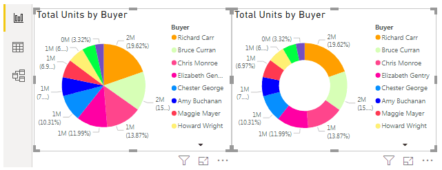
Pie and Donut Charts
4. Area Charts
Area charts are similar to line charts but with the area below the line filled in, useful for emphasizing the magnitude of change over time.
- Stacked Area Chart: Shows the contribution of each part to a total over time.
- 100% Stacked Area Chart: Displays the percentage distribution of each category over time.
Usage Example: Displaying the composition of total sales, costs and units by different category
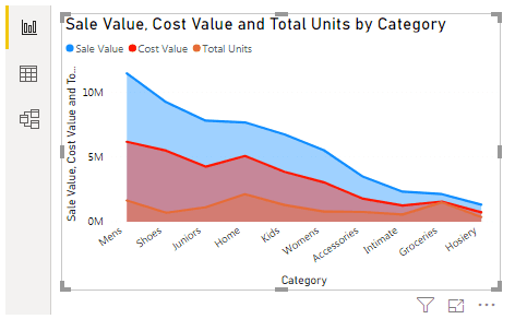
Area Chart
5. Scatter and Bubble Charts
Scatter and bubble charts are used to show relationships between two or more variables.
- Scatter Charts: Display individual data points to highlight correlations.
- Bubble Charts: Similar to scatter charts but with an additional dimension represented by the size of the bubbles.
Usage Example: Analyzing the relationship between Sales per sq. feet and Total Sales Variance by Districts
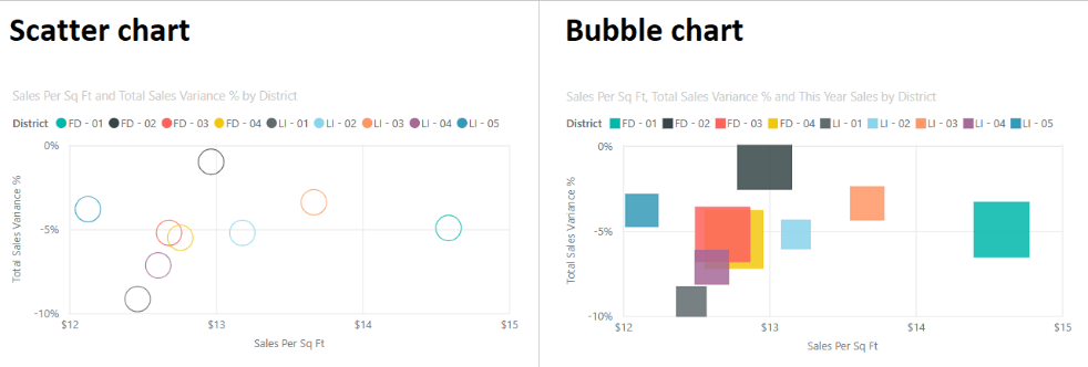
Scatter and Bubble Charts
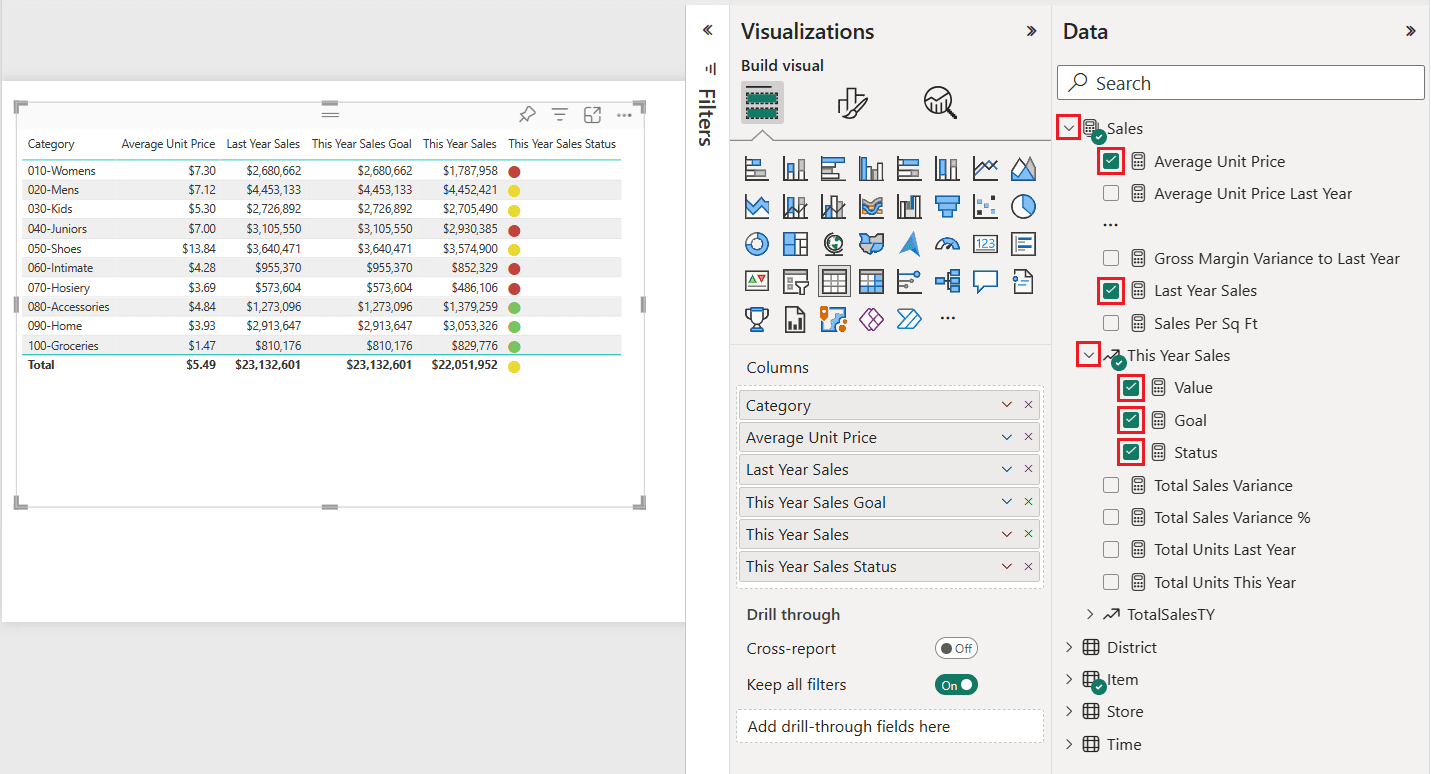
Tables in Power BI
Tables are essential for displaying detailed data in a structured format. Power BI offers two main types of tables:
1. Standard Tables
Standard tables display data in a simple tabular format with rows and columns. To create a standard table:
- Select the Table icon from the Visualization pane.
- Drag and drop the fields you want to display into the Values area.
2. Matrix Tables
Matrix tables allow for a more hierarchical display of data, similar to pivot tables in Excel. They enable you to drill down into data by categories. To create a matrix table:
- Select the Matrix icon from the Visualization pane.
- Drag and drop the fields into the Rows, Columns, and Values areas as needed.
Tables in Power BI
Advanced Visualizations in Power BI
Beyond the basic charts, Power BI provides advanced visualization options for more complex data analysis:
1. Treemaps
Treemaps are hierarchical charts that use nested rectangles to represent data, where the size and color of each rectangle indicate the value.
Usage Example: Analyzing count of product by category and manufacturer.
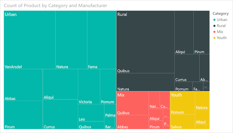
Treemap
2. Waterfall Charts
Waterfall charts show the cumulative effect of sequentially introduced positive or negative values, useful for understanding the incremental impacts on a total.
Usage Example: Illustrating the Total Sales Variance by Fiscal Month.
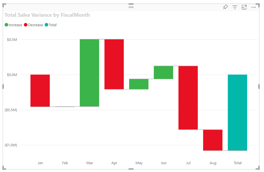
Waterfall Chart
3. Heatmaps
Heatmaps use color to represent data density or intensity, making them excellent for spotting patterns and correlations in large data sets.
Usage Example: Visualizing website traffic across different pages and times.
4. Gauge Charts
Gauge charts are used to show progress toward a goal, with a needle indicating the current value against a target.
Usage Example: Tracking key performance indicators (KPIs) like monthly sales targets.
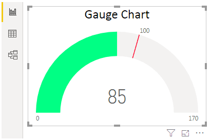
Gauge Chart
How to Create a Chart in Power BI
- Open Power BI Desktop:
- Launch Power BI Desktop on your computer.
- Connect to Your Data Source:
- Click on the “Home” tab.
- Select “Get Data” to choose your data source (e.g., Excel, SQL Server, etc.).
- Follow the prompts to load your data into Power BI.
- Load Data into Power BI:
- Once you’ve connected to your data source, select the relevant tables or sheets.
- Click “Load” to import the data into Power BI.
- Prepare Your Data:
- In the “Data” view, you can clean and transform your data if needed.
- Use the “Query Editor” to make any necessary adjustments, such as removing duplicates or filtering rows.
- Create a New Report:
- Switch to the “Report” view by clicking the “Report” icon on the left-hand side.
- Add a New Chart:
- In the “Visualizations” pane on the right, click on the type of chart you want to create (e.g., bar chart, column chart).
- A blank chart visual will appear on the canvas.
- Select Data for Your Chart:
- In the “Fields” pane, drag and drop the fields you want to visualize onto the chart.
- For a bar or column chart, drag a categorical field (e.g., product category) to the “Axis” section.
- Drag a numerical field (e.g., sales amount) to the “Values” section.
- Customize the Chart:
- Use the “Format” pane (paint roller icon) to customize the appearance of your chart.
- Adjust settings such as colors, labels, titles, and grid lines to enhance readability and aesthetics.
- Add Interactivity:
- Enhance your report by adding slicers, filters, and drill-through options to allow users to interact with the data.
- Save and Publish:
* Save your Power BI report by clicking on “File” and selecting “Save As.”
* To share your report, you can publish it to the Power BI service by clicking on the “Publish” button in the “Home” tab.
Enhancing Your Visualizations
Power BI provides several tools and features to enhance your visualizations:
- Filters and Slicers: Use filters and slicers to allow users to interact with your data and focus on specific subsets.
- Conditional Formatting: Apply conditional formatting to highlight important data points or trends.
- Custom Visuals: Explore the Power BI marketplace for additional custom visuals that can offer more tailored visualizations for your data.
Best Practices for Effective Visualizations
- Choose the Right Visualization: Select the visualization type that best represents your data and the story you want to tell.
- Keep it Simple: Avoid cluttering your visuals with too much information. Focus on key insights.
- Use Consistent Colors and Formatting: Maintain consistency in colors and formatting to make your reports more readable and professional.
- Provide Context: Include titles, labels, and legends to provide context and make your visuals easier to understand.
Conclusion
Power BI's versatile visualization capabilities make it an indispensable tool for data analysis and reporting. By mastering the basics of charts, graphs, and tables, you can create compelling and insightful visualizations that drive data-driven decision-making. Whether you're new to Power BI or looking to refine your skills, these visualization essentials will help you unlock the full potential of your data.
Key Takeaways on Visualization in Power BI
- Power BI offers built-in visuals like bar charts, line charts, pie charts, maps, and more, with additional custom visuals available from the marketplace.
- Dashboards in Power BI allow users to drill down into data, filter information, and view details on demand for a deeper understanding of trends.
- Power BI connects to various data sources, including Excel, SQL Server, Azure, and online services like Google Analytics.
- Supports real-time data streaming to visualize and monitor live data, useful for tracking key performance indicators (KPIs).
- Bar and column charts are ideal for comparing quantities across categories, with bar charts for long category names and column charts for data changes over time.
- Line charts are perfect for showing trends over time, with single line charts for one variable and multiple line charts for comparing multiple variables.
- Pie and donut charts are used to represent proportions of a whole, with donut charts providing an aesthetic variation with a blank center.
- Power BI includes standard tables for simple tabular data display and matrix tables for hierarchical data display similar to Excel pivot tables.
- Advanced visualizations in Power BI include treemaps for hierarchical data, waterfall charts for cumulative effects, heatmaps for data density, and gauge charts for tracking progress toward goals.


