Power BI is a powerful business intelligence tool that helps users visualize data, gain insights, and make data-driven decisions. Two important features in Power BI that enhance data exploration and presentation are Grouping and Power Maps. This article explores how these features work and how they can be leveraged to improve your data analytics.
What is Grouping in Power BI
In Power BI, Grouping allows users to combine individual data points into larger categories. This feature is particularly useful when you have a large dataset with numerous distinct values that can be grouped into broader categories for easier analysis. Instead of focusing on individual data points, Grouping enables you to summarize or aggregate data, making the results more interpretable.
Power BI provides various ways to group data, depending on the type of dataset and analysis goals. The two main grouping types are manual grouping and automatic binning.
1. Manual Grouping
Manual grouping allows users to select data points and manually define their groupings. This feature is especially useful when dealing with non-numeric data or when specific categories need to be created based on business requirements.
How to Create Manual Groups:
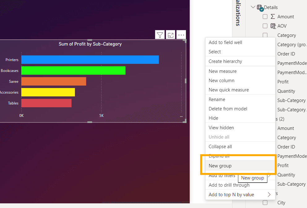
- Select a visual on the report page.
- Right-click the field that needs to be grouped, then choose "Group."
Grouping in Power BI
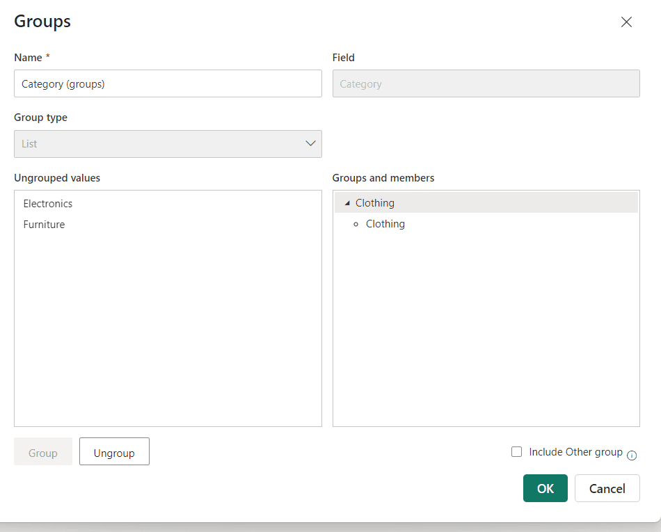
- From the dialog box, select the data values to be grouped.
- Assign the selected values to a new group.
- Name the group and click "OK" to apply.
Assigning Values to a Group
Example:
If a dataset contains products (e.g., "Laptop," "Desktop," "Tablet"), the user can group them manually under broader categories such as "Computers" and "Mobile Devices."
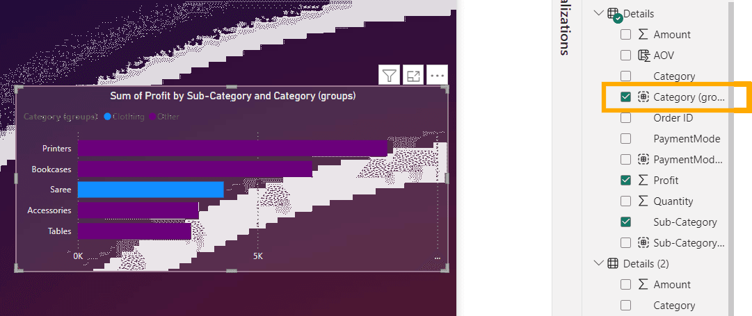
Grouping Output
2. Automatic Binning (Numeric and Date Grouping)
Power BI also offers automatic grouping for numerical data, which is referred to as binning. This type of grouping is ideal for organizing continuous data into defined intervals (bins).
Steps to Use Binning in Power BI:
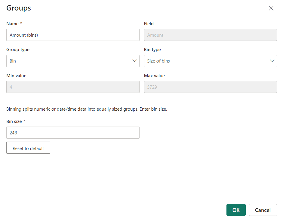
- Select a numeric field from the dataset.
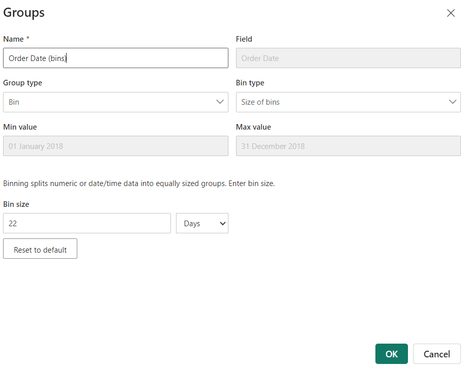
- Right-click and select "New Group."
- In the grouping settings, define the size of the bins (e.g., every 10 units).
- Power BI will automatically distribute the data points into bins of the specified size.
Binning in Power BI
Example:
For sales data with values ranging from 0 to 1000, binning can create groups in intervals of 100 (e.g., 0-100, 101-200, and so on), making it easier to analyze sales patterns.
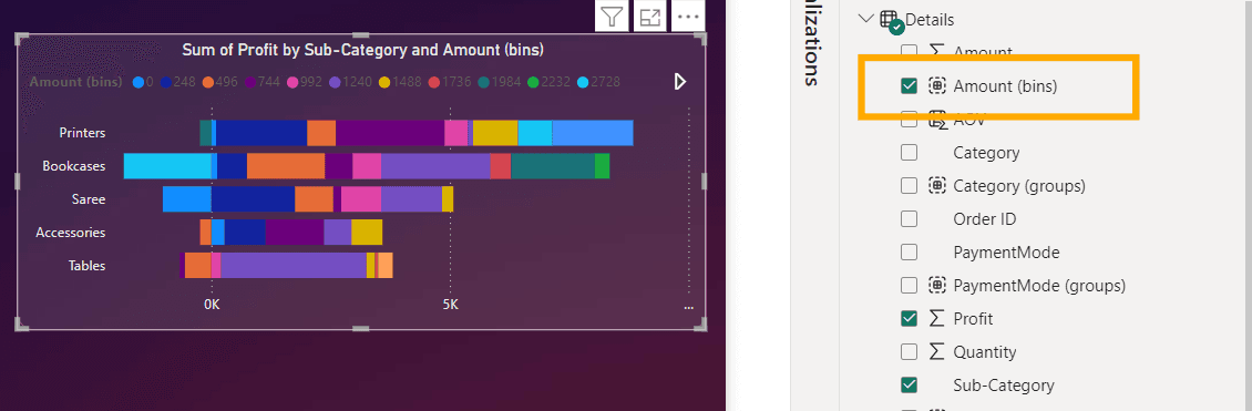
Binning Output
Date Grouping:
Similar to numeric binning, Power BI can also group data based on time intervals. For example, you can group a "Date" field by:
- Year
- Quarter
- Month
- Weekday
This feature is especially useful in time-series analysis, where understanding data trends over time is crucial.
Date Grouping
Benefits of Grouping
- Simplifies Data Analysis: Instead of working with hundreds or thousands of individual data points, you can create meaningful groupings that reveal patterns and trends more clearly.
- Enhanced Visualization: Grouping allows for more effective visualizations by reducing clutter and making charts easier to read and interpret.
- Custom Aggregation: You can group items based on business rules or specific analysis needs, making the data more relevant to your goals.
What is Power Map in Power BI
Power Map in Power BI, part of the 3D Maps functionality, enables users to visualize geographic and time-based data in new and dynamic ways. By plotting data on a map, you can explore trends, patterns, and insights based on location, making it a highly effective tool for analyzing data with a geographic component.
Key Features of Power Map
- 3D Visualization: Power Map offers an interactive 3D globe that allows users to zoom, rotate, and explore data in a spatial context.
- Geographic Data: It supports data linked to geographic elements such as countries, cities, postal codes, and even latitude/longitude coordinates.
- Time-Based Data: Power Map also allows you to visualize changes in data over time, making it an excellent tool for analyzing trends across different periods.
- Multiple Layers: You can layer multiple data points on the map to compare different variables, providing a comprehensive view of your data.
How to Use Power Map
To create a Power Map in Power BI, you need geographic data. Follow these steps to build a Power Map:
- Load Data with Geographic Fields: Make sure your dataset contains geographic fields like countries, cities, or coordinates.
- Add the Map Visual: In Power BI, select the "Map" visualization from the Visualizations pane.
- Assign Geographic Data to Map Fields: Drag the geographic fields (e.g., city, country) to the "Location" field of the map visual. Bubbles representing states/cities will be seen on the map.
- Customize the Map: You can add data points to the map by dragging relevant numerical or categorical fields into the “Values” section.
- Bubble Size: Additionally, the Power BI basic map allows you to adjust the bubble sizes based on data. For example, drag the Order ID into the Bubble Size tab to display the number of orders from each state.
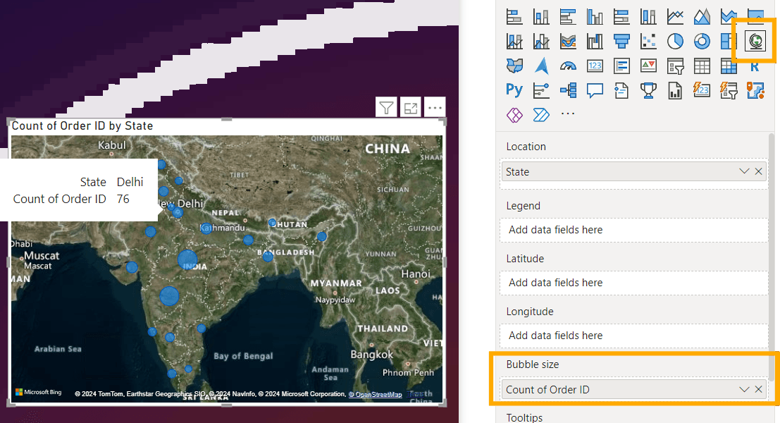
Power Map in Power BI
Larger bubbles indicate more orders, while smaller bubbles represent fewer orders. Hovering over a bubble will display additional information, such as the country name and order count in the tooltip.
- 3D Maps: To enable Power Map (3D Maps), you can use Power BI Desktop in combination with Excel or explore similar geospatial features within Power BI itself.
Applications of Power Map
- Sales and Marketing: Map out customer locations, sales territories, and distribution channels to identify geographic trends and target specific regions for marketing campaigns.
- Logistics and Supply Chain: Use Power Map to track shipments, analyze supply chain efficiency, and identify bottlenecks based on geography.
- Public Health and Government: Map out disease outbreaks, service delivery points, or population statistics to support decision-making and resource allocation.
Benefits of Power Map
- Spatial Analysis: Power Map helps businesses and organizations uncover patterns and trends in their data that are related to location, such as sales concentration or service coverage.
- Dynamic Interaction: The 3D environment allows users to interact with the data in real time, providing more meaningful insights and a better understanding of geographic distribution.
- Historical Data Exploration: The time-based functionality in Power Map makes it possible to analyze how data changes over time, offering valuable insights into historical trends.
Conclusion
Grouping and Power Map in Power BI are powerful tools that significantly enhance data analysis and visualization. Grouping allows users to simplify and categorize complex data, while Power Map provides a unique, spatial perspective on geographic and time-based information. Together, they enable more insightful decision-making and a deeper understanding of data, especially in business intelligence contexts where location and category-based analysis play crucial roles.
Key Takeaways on Grouping and Power Map in Power BI
- Grouping in Power BI helps categorize data into larger, more manageable groups for simplified analysis.
- Two types of Grouping are available: manual grouping for non-numeric data and automatic binning for numeric or date-based grouping.
- Manual grouping allows the user to create custom categories, ideal for business-specific data groupings.
- Automatic binning segments numeric data into defined intervals, helping to analyze continuous data effectively.
- Date grouping offers time-based aggregation by year, quarter, month, and day, useful in time-series analysis.
- Grouping enhances data visualization, simplifies analysis, and allows for custom aggregation based on business needs.
- Power Map in Power BI is a 3D visualization tool used for geographic and time-based data insights.
- It supports data linked to geographic locations such as cities, postal codes, and latitude/longitude coordinates.
- Power Map enables the visualization of changes over time and multiple data layers for comparative analysis.
- Users can create Power Maps by loading geographic data, adding map visuals, and assigning values such as location and bubble size to visualize data points.
- Power Map is applied in fields such as sales, marketing, logistics, public health, and more, offering insights based on geography.
- Both features, Grouping and Power Map, together offer advanced data analysis tools for better decision-making and comprehensive insights.


