Power BI, a business analytics service by Microsoft, provides interactive visualizations and business intelligence capabilities with a simple interface for end users to create their own reports and dashboards. Among its various features, the scatter chart and waterfall chart are two powerful tools for data visualization, each serving unique purposes. This article explores these charts in detail, discussing their features, use cases, and how to create and use them effectively in Power BI.
What are Scatter Charts in Power BI?
A scatter chart, also known as a scatter plot, uses Cartesian coordinates to display values for typically two variables for a set of data. The data is displayed as a collection of points, each having the value of one variable determining the position on the horizontal axis and the value of the other variable determining the position on the vertical axis.
Key Features of Scatter Charts
- Visualization of Relationships: Scatter charts are ideal for visualizing the relationship between two numerical variables.
- Identification of Correlations: They help identify trends, correlations, and patterns within the data.
- Data Points Representation: Each data point represents an observation in the dataset, making it easy to spot outliers.
- Additional Dimensions: The size and color of the points can represent additional dimensions of data.
When to Use Scatter Charts
- Correlation Analysis: When you need to analyze the correlation between two variables.
- Distribution Patterns: To understand how data points are distributed across different values.
- Outlier Detection: Useful for identifying anomalies in the data.
Steps to Create a Scatter Plot in Power BI
- Load Data: Begin by loading your dataset into Power BI.
- Select Scatter Chart: In the Visualizations pane, select the scatter chart icon.
- Add Data Fields: Drag the desired fields to the "X-Axis," "Y-Axis," and "Values" areas. Optionally, you can add fields to "Legend" and "Size" to add more dimensions to your data points.
- Customize Appearance: Use the Format pane to customize the appearance, including colors, shapes, and titles.
Example
Consider a dataset containing employee data. You can create a scatter chart to visualize the relationship between different job roles and their respective monthly incomes across various departments. This can help identify trends and comparisons, such as which job roles within a department tend to have higher or lower monthly incomes. For example, you could see whether research directors in the R&D department earn more than sales executives in the sales department.
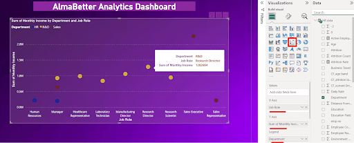
Scatter Chart Example in Power BI
What are Waterfall Charts in Power BI?
A waterfall chart shows the cumulative effect of sequentially introduced positive or negative values. It's an effective way to visualize how an initial value is affected by a series of intermediate positive or negative values.
Key Features of Waterfall Charts
- Incremental Changes: They effectively display the incremental changes in the data over time or categories.
- Bridging Values: Show the transition from a starting value to an ending value.
- Color Coding: Positive and negative changes are usually color-coded for better visualization.
When to Use Waterfall Charts
- Financial Analysis: Ideal for showing financial data, such as profits and losses over a period.
- Contribution Analysis: To visualize how different components contribute to a total value.
- Process Analysis: Useful for breaking down complex processes into individual steps and understanding their impact.
Steps to Create a Power BI Waterfall Chart
- Load Data: Start by importing your dataset into Power BI.
- Select Waterfall Chart: From the Visualizations pane, choose the waterfall chart icon.
- Add Data Fields: Drag fields to the "Category," "Y-Axis," and "Breakdown" areas. The "Category" field typically represents the different stages or periods.
- Configure Data: Adjust the settings to correctly represent positive and negative values, ensuring the chart accurately reflects the cumulative changes.
- Format Chart: Customize the chart using the Format pane to adjust colors, labels, and other visual elements.
Example
Consider a dataset containing profit data across various categories and months. You can create a waterfall chart to visualize the changes in profit over time and across different categories. This type of chart helps in understanding the cumulative effect of sequential positive and negative values, such as seeing how individual categories contribute to the overall profit change. For example, you can observe the profit changes in Electronics and Furniture categories for different months and see how each category affects the total profit incrementally.
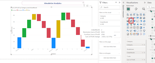
Waterfall Chart Example in Power BI
Detailed Comparison and Use Cases
Scatter Chart Power BI vs. Waterfall Chart Power BI
- Purpose:
- Scatter Chart: Best for analyzing relationships between two numerical variables.
- Waterfall Chart: Best for showing cumulative effects of sequentially introduced values.
- Visualization:
- Scatter Chart: Represents data points on a two-dimensional grid.
- Waterfall Chart: Represents changes as vertical bars, with color-coded positive and negative values.
- Applications:
- Scatter Chart: Used in fields such as market research, economics, and social sciences.
- Waterfall Chart: Commonly used in financial analysis, operational metrics, and project management.
Integrating Both Charts in Reports
Integrating both scatter and waterfall charts in a Power BI report can provide comprehensive insights. For example, a business analyst might use a scatter chart to understand the relationship between marketing spend and revenue, and a waterfall chart to break down the overall revenue changes into individual components.
Advanced Features and Customization
Enhancing Scatter Charts
- Adding Trend Lines: Helps in identifying the direction and strength of the relationship between variables.
- Clustering: Grouping similar data points together to identify patterns within subgroups.
- Tooltip Customization: Adding detailed information that appears when hovering over data points.
Enhancing Waterfall Charts
- Breakdowns: Allows the breakdown of bars to show detailed contributions of various factors.
- Conditional Formatting: Using different colors based on specific conditions to highlight important changes.
- Connecting Lines: Adding connecting lines to visualize the cumulative trend more clearly.
Conclusion
Scatter charts and waterfall charts are indispensable tools in Power BI, each offering unique ways to visualize and analyze data. Scatter charts excel in displaying relationships and correlations between numerical variables, while waterfall charts effectively show the cumulative impact of sequential changes. By understanding how to create, customize, and utilize these charts, users can derive deeper insights and make informed decisions based on their data.
Key Takeaways on Scatter Chart and Waterfall Chart in Power BI
- A scatter chart, or scatter plot, uses Cartesian coordinates to display values for two variables as a collection of points.
- Scatter charts are ideal for visualizing relationships, identifying correlations, and spotting outliers in data.
- They can represent additional data dimensions through the size and color of points.
- Common use cases for scatter charts include correlation analysis, distribution pattern analysis, and outlier detection.
- To create a scatter plot in Power BI, load your data, select the scatter chart icon, add data fields to the "X-Axis," "Y-Axis," and "Values" areas, and customize the appearance.
- A waterfall chart shows the cumulative effect of sequential positive or negative values, displaying incremental changes over time or categories.
- Waterfall charts use color coding to differentiate positive and negative changes and are useful for financial analysis, contribution analysis, and process breakdowns.
- To create a waterfall chart in Power BI, load your data, select the waterfall chart icon, add fields to "Category," "Y-Axis," and "Breakdown" areas, and configure data settings and appearance.
- Scatter charts are best for analyzing relationships between numerical variables, while waterfall charts are best for showing cumulative effects.
- Integrating both scatter and waterfall charts in Power BI reports can provide comprehensive insights, such as analyzing marketing spend vs. revenue and breaking down revenue changes into components.


